


Matthews and Carter Associates is a small London-based legal recruitment firm that places common-law qualified lawyers into prestigious roles across global legal markets. While specialising in the Australia-to-London recruitment corridor, the firm has expanded its network to include opportunities in New York, Singapore, and other major hubs.
As the company had scaled, they required a lawyer-focused website to attract more candidates to increase placements.
Design and build a responsive website to attract legal talent and drive candidate acquisition for global placements.
1st of December 2024 - 31st of January 2025
Heuristic Website Analysis
Stakeholder Interview
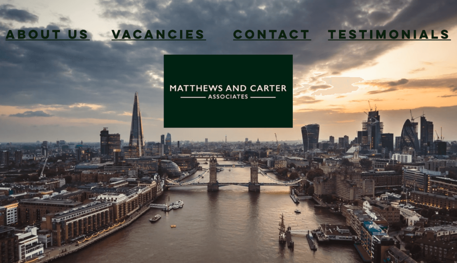
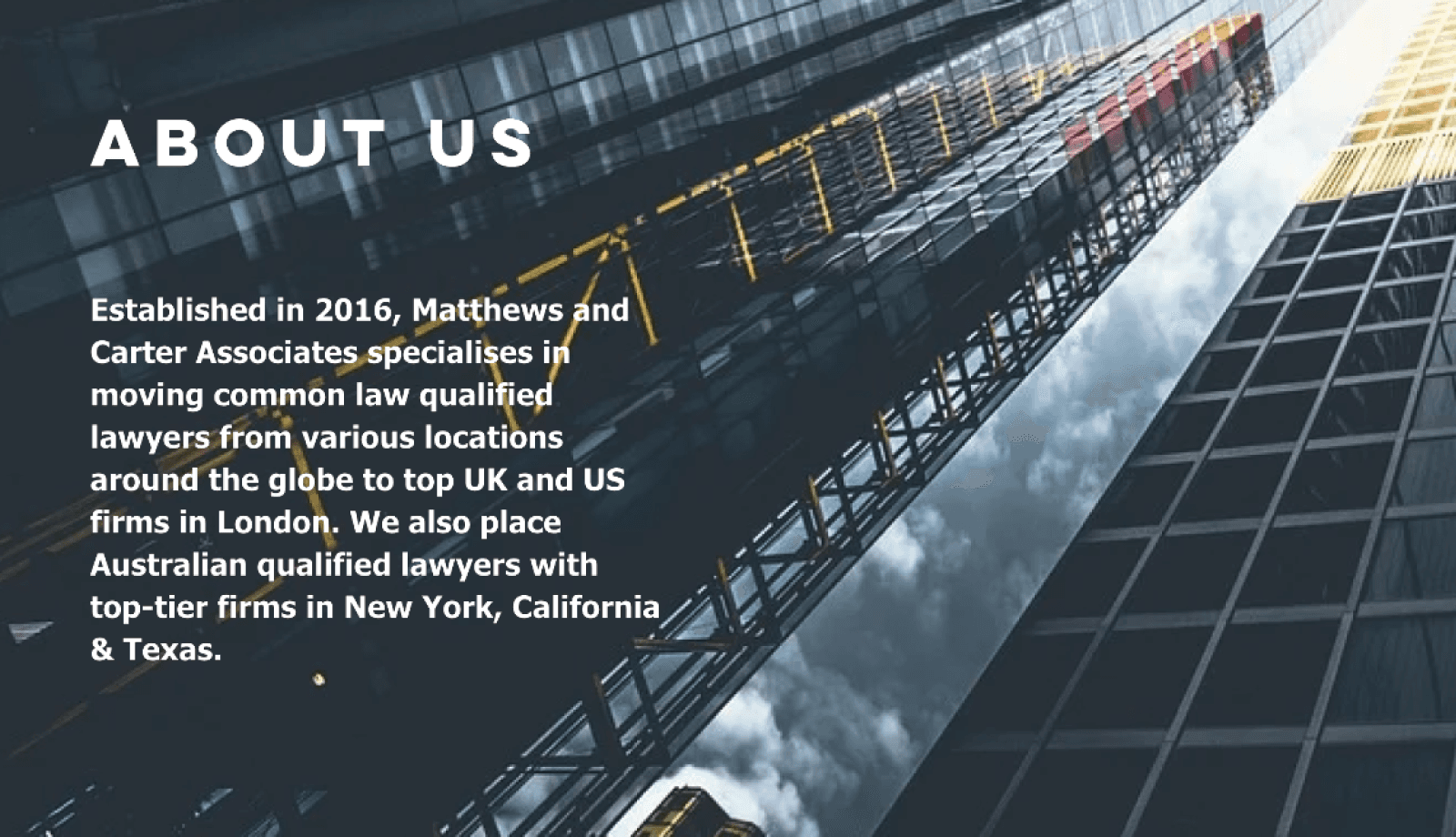
On entering the previous website, it was unclear what the company offered, with a heavy focus on London and no clear call-to-action.

Vacancies were hidden in a carousel, and it was difficult to quickly identify key job details due to the information hierarchy.
The website did not explain what the service was to user should expect, from initial contact to starting a new position.
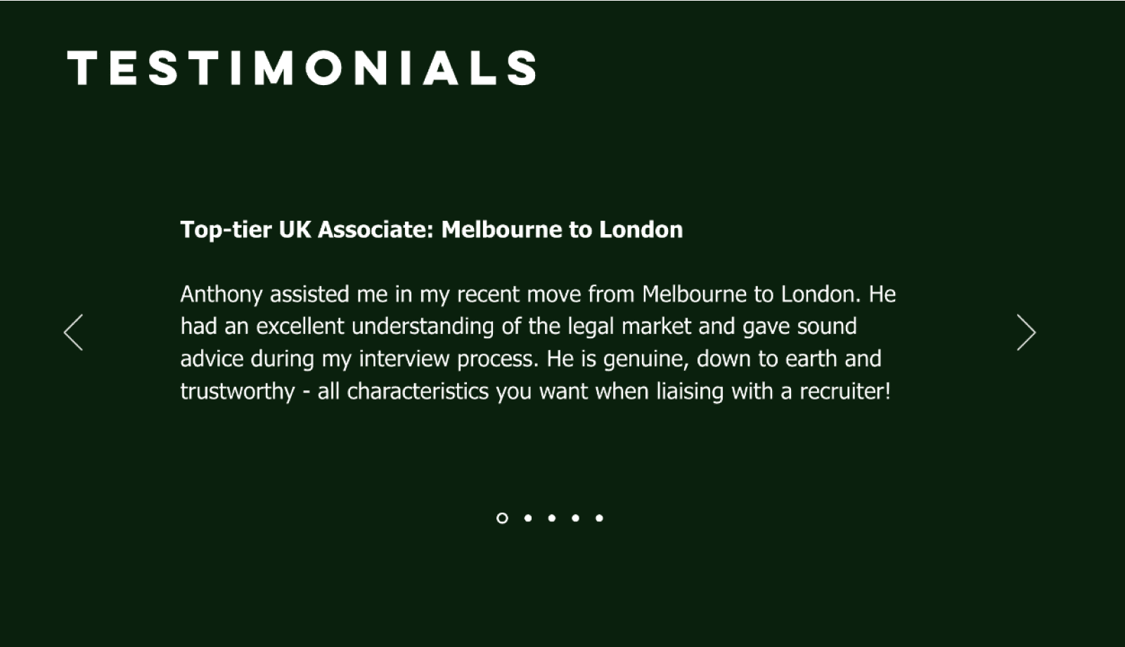
While testimonials helped build trust, they were hidden, and the lack of highlighted keywords made the content harder to scan.
I searched for legal recruiters which operate in top global legal markets. The ones that came up most were ‘EJ Legal’, ‘Major, Lindsay and Africa’, ‘Beacon Legal’, and ‘McKinley law.’ I performed a heuristic analysis on their websites and took away 4 main insights:
CLARITY
Candidate could potentially be moving to the other side of the world they should be reassured they are in good hands.
SOCIAL PROOFING
EJ Legal showed testimonials on their homepage but not the names or images of either the candidates or companies. Company logos, names of reviewers, etc, are usually included to increase trust.
VISUAL IDENTITY
The websites all felt very similar. The images were mainly stock images combined with long paragraphs of text. Because the websites were generic and functional, they felt like an afterthought.
VISUAL HIERARCHY
Finding a job is the user's main goal, so navigating multiple pages to reach vacancies increases friction. The interfaces of the vacancy pages were saturated with information, but Becon Legal hardly had any jobs on them.
Prestigious law firms in London and New York avoid being seen as actively recruiting associate lawyers, as it could undermine their perceived desirability. In London, firms are often referred to as part of the Magic or Silver Circle; in New York, they are known as White Shoe firms.
Using company names or lawyer headshots would harm client relationships and negatively impact the business.
We will have exclusive or rare job vacancies on our site
This will make social proofing and trust-building more difficult.
From a meeting I had with the company director Anthony the main insights I gathered were:
THE BUSINESS
The typical candidate lawyer is 27-30 years old from Austrailia or New Zealand.
90% of hires are in the London market, but the share in New York, Dublin and Singapore is growing.
The company writes articles about developments in the legal market but these are only on LinkedIn.
THE USER
Candidates are motivated by working for the world’s most prestigious legal firms in addition to higher salaries.
Australian and New Zealander candidates are generally more approachable and laid back compared to their UK counterparts.
UNIQUE VALUE PROPOSITION
Candidates get access to exclusive job opportunities, market expertise, and years of experience moving people.
The service costs nothing for candidates and includes CV optimisation, interview prep, and advice about relocating.
Users should know how the service works and what benefit this gives them before they sign up. The information should be prominent and easy to scan.
Users should easily find and browse job vacancies. The client should be able to add and delete vacancies and locations easily.
Users should immediately see success stories and relevant opportunities. Trust-building elements must be prominent and easy to scan, while respecting hiring firms’ need for confidentiality.
I started with a mid-fidelity wireframe as I am comfortable with the platform compared to pen and paper; this meant I could save time on the project. I sought to tackle the Design Goals previously defined.
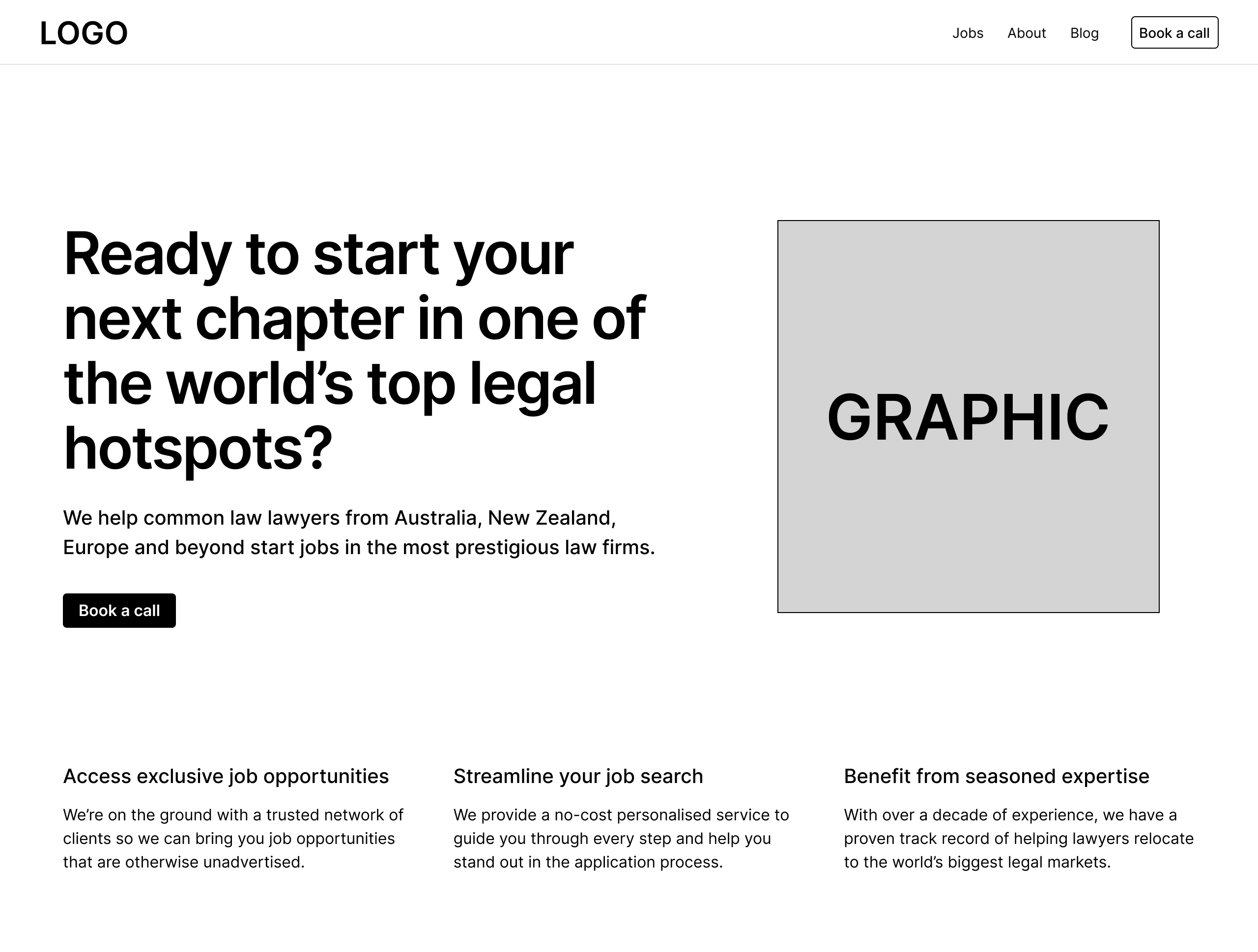
As we had low brand recognition, I decided the text needed to be as clear as possible. I added a pill saying what the business is and made the button text more personal.
I considered the three main ways users get value from the service and prominently featured them so the titles appear ‘above the line.’
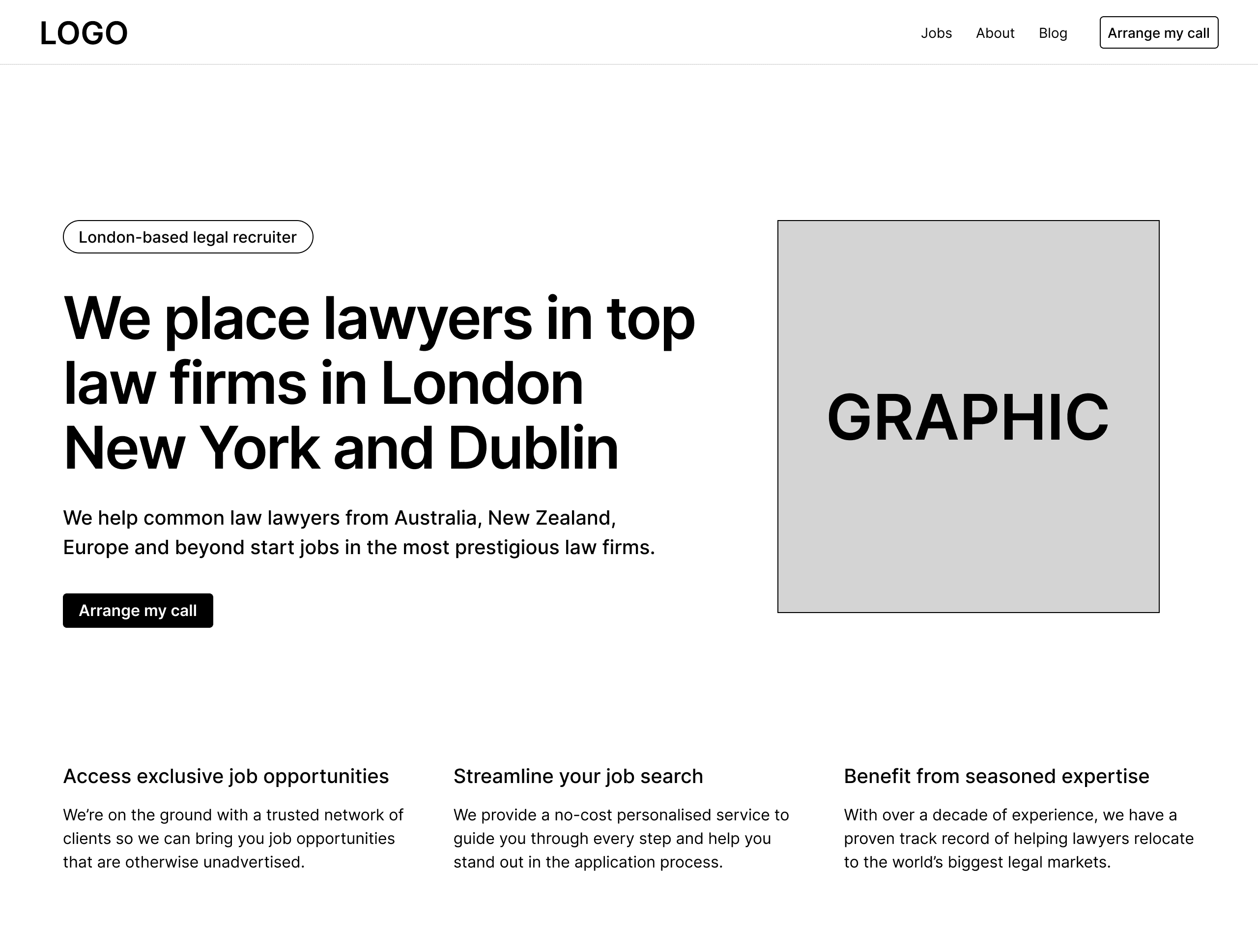

I changed the title to make it more personal and convey that Matthews and Carter had a proven way of working. So users would see the text first, I moved it to the left.
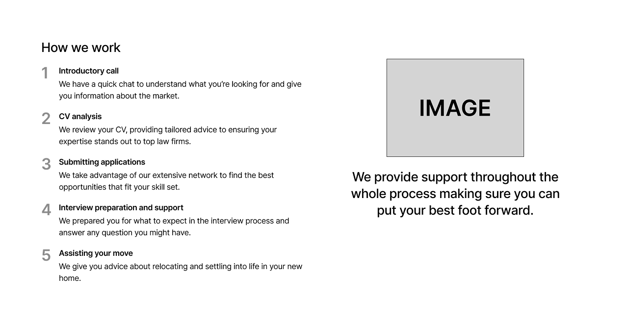
Considering the lack of information from competitors, I decided users would get more value from 5 in-depth steps. It is demonstrable that users will have a lot of support throughout the process.
I filtered the jobs into cities as the most important factor for users was the destination. The city filters were instantly visible when you entered the page so users could instantly go to the location they wanted.
The vacancies were placed in a grid, making it easy for the company to add and delete them. Because the company is small, easy maintenance was key when designing the interface.
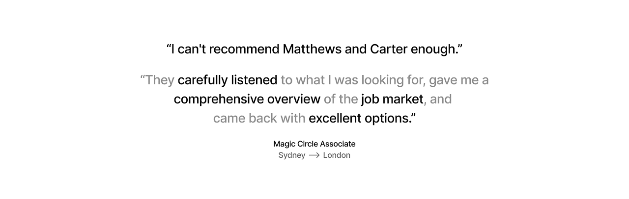
I wanted testimonials to have a visual impact to counteract not being able to use successful candidate names or their company. This quote is directly under the hero section and emphasises the values propositions directly above.
Another quote below the ‘How we work’ section reinforces the support the user will receive at every step in the process.
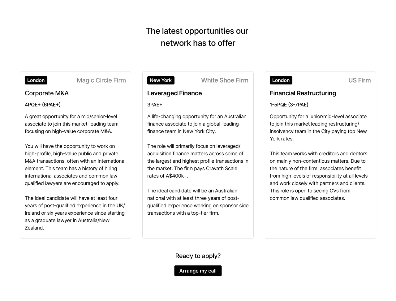
I displayed these jobs underneath the first quote. As they are jobs with prestigious companies (Magic Circle & White Shoe firms) and either exclusive to the website or rare online, this gives real value to the user and builds trust in the companies network.
Once we were happy with the copy and content of the website I created the high-fidelity prototype before building it on Framer.
50
100
200
300
400
500
600
700
800
900
The colour palette is consistent with the client's existing dark green and white branding. On the whole site, I only used these 10 shades except for the orange CTA button and white section backgrounds.
700 - brand color background
50 - text

card background
texture
white background
900 - text

card background
texture
The typeface is Geist in a 1.250 major third scale
hero text
quote text
cta titles
paragraph title
paragraph text medium
paragraph text regular
button & links text
At first, I put the job vacancy cards in a grid layout following the wireframe, but I saw that this created a 'wall of text' effect that made it difficult to read.
In my first attempt to solve the problem, I put a darker overlay on the cards by default that would disappear when hovered over. It solved the 'wall of text' problem, but now the vacancies were dull when you entered the page.
I decided that a horizontal card with two sections was the best solution, considering time constraints. This meant users could parse information easily, with minimal additional scroll time. Also, maintenance was more straightforward, as the page was a one-column grid across all screen sizes.
The client writes articles on LinkedIn and lawyer-focused websites. We agreed that hosting a blog on the website to attract more traffic would be a 'nice-to-have'. As I moved into the design/build phase, we prioritised the homepage and the jobs page.
I would have had to learn the Framer blog CMS and then instruct the client how to use it. This would risk meeting the final deadline. We decided that this would be a feature we would implement in the future.

Rivals had static sites that were functional but not memorable. First of all, I wanted to utilise microinteractions and animations to aid users in getting the necessary information. Secondly, I wanted to convey a sense of craft and care for the presentation to reflect the quality of service they would receive from the company.

The pin is made of two parts: upper and lower. The upper part has a heavier mass, causing a larger spring. This division made the animation feel more alive than a static pin
Arrange my call
When hovered, all buttons have a smooth color change transition design that is subtle and pleasant but still noticeable.
To highlight the navigation bar, it changes between the brand green background or a white background in contrast to the section background.
The hamburger animation is based on Spin by Jonathan Suh.
Although two large solo testimonials are featured higher up the page, I still wanted to show other testimonials to further demonstrate the quality of service. The pop-out animation draws attention to a high-value section and reveals the title. To increase scannability and impact, I used the most valuable part of the testimonial as a quote/title and gave the user the option of expanding to see the whole quote.
The candidates that contacted the company through the website and were then able to start the recruitment process trebled. Candidates said they found the website clear and informative.
98% of users entered the site through the homepage, and 38% continued to the jobs page. This shows the high value of a quickly accessible vacancy offering to users and the client. This is in contrast to the vacancy offerings on competitors' sites.
The site has twice as many page views as unique visitors, meaning many people return. Moving city, country, or even continent is not easy or quick, so this could mean more conversions down the line.
I was in charge of all aspects of the project from end to end, so good time management was a must. I planned the project in stages with deadlines and had regular meetings with the company to align on strategy. I'm proud that I was able to meet deadlines, especially over the busy Christmas period.
I am grateful for the level of trust Matthews and Carter Associates gave to me. I enjoyed building the site because it involved problem solving and increasing my skillset — learning more about Framer and the potential of this powerful tool.
The planned launch of the website was February 1st. The two-month time frame necessitated prioritising certain ideas. For example, instead of the Articles page linking users to the company's articles on LinkedIn, a regularly updated blog page would have the potential to increase traffic to the site and increase conversions. Changing the company strategy and learning Framers blog CMS could have jeopardised the timeline of the project; however, we have discussed adding this feature in the future.
During this project, I learned a lot about animation principles. I set out to combine micro-animations and interactions with clear copy to help guide users to the information they needed. Micro-interactions can greatly enhance the user experience, making the site more memorable. The target users are young, tech-savvy lawyers, so an intuitive and enriched experience can make the client stand out compared to larger rivals with static corporate websites.
I am really lucky to have a network of friends and mentors I can rely on to give me honest, clear advice, improving my growth as a designer. Sean Fleming helped me so much in regards to copy, SEO and CRO. Tanel Sepp gave me great advice about content and best practices. Fabrizia Ausiello provided a lot of constructive criticism on the visual design and accessibility.
My Email
hey@joe-watson.com
My Resume
My Socials